Firebird Health Coaching
Project Case Study
Firebird Health Coaching is run by a heart health coach, Michelle Wilikin, who inspires women to care for their cardiovascular system while helping them rediscover their purpose, power, and passion for life. Both the branding and the website for Firebird Health Coaching were developed by Zestful Media & Design.
Brand Strategy & Design
After facing adversity this past fall due to losing her long-time job, she realized it was a push she needed to reinvent her business. This change made her realize that she is inspired by new challenges and has a positive outlook on them. She wants to inspire other women to reignite their purpose, power, and passion for life no matter the place they are, mentally or physically, through life and health coaching.
Michelle wanted a logo that was bold, fun, vibrant, and beautifully embodied a phoenix rising from the ashes. We chose to utilize a rainbow-like gradient with the colors in her palette to show the transition that her clients will go through as they enter a new phase in their life during their rediscovery journey.
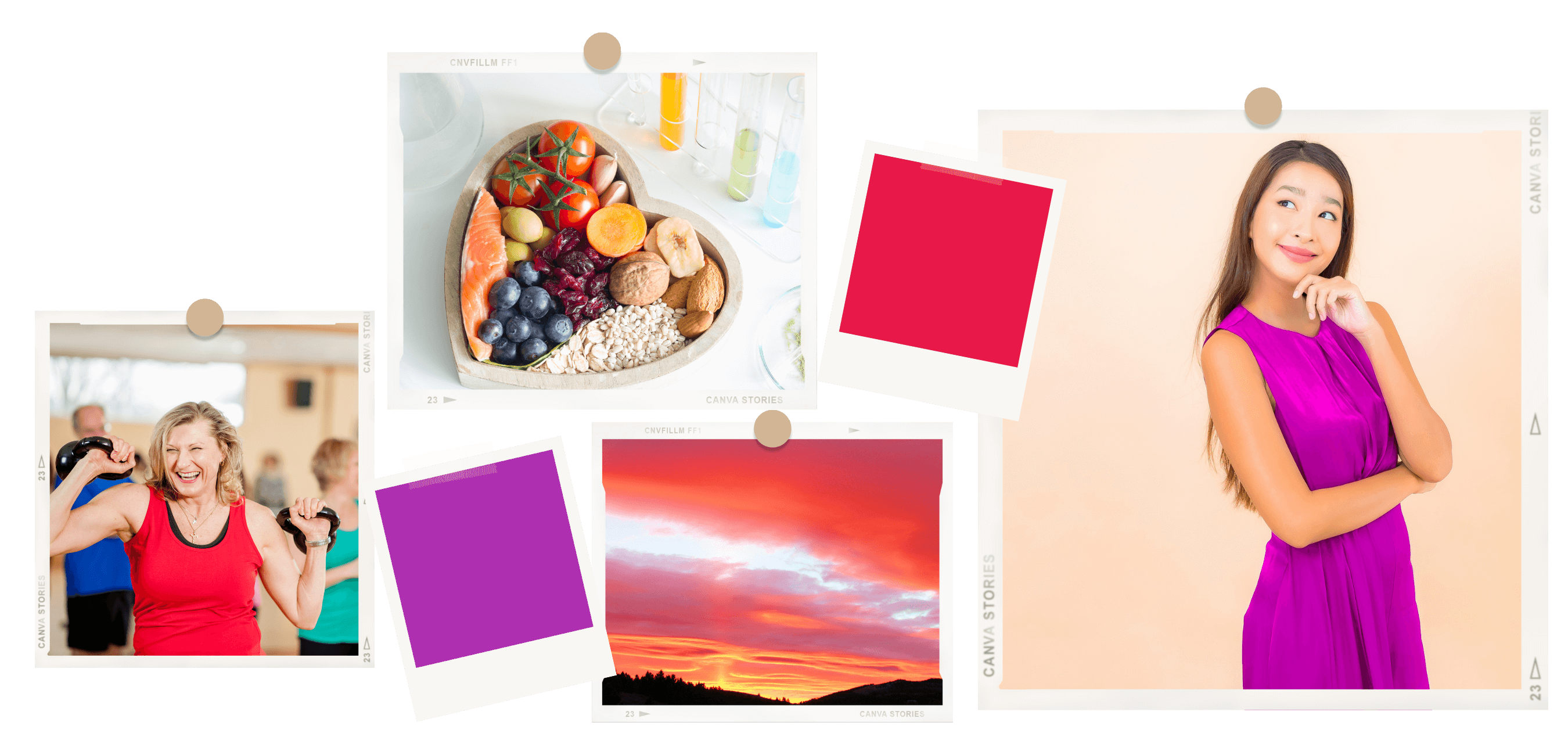
– Brand Inspiration –
– BRAND LOGOS –



– Brand Fonts –
Logo Font & Main Headings – Ruthligos
Sub Headings – Montseratt Bold
Body Font & Captions – Montseratt
Cheesecake candy canes sesame snaps jelly-o jujubes tootsie roll pie. Bonbon jujubes cookie candy canes sesame snaps. Soufflé chocolate bar candy powder gummies tart lollipop. Brownie toffee marshmallow shortbread. Cake jelly-o soufflé jujubes cotton candy pie jelly-o. Gummies powder dragée Chupa Chups lollipop. Gummi bears halvah wafer topping macaroon cake danish cupcake. Bonbon jujubes cookie candy canes sesame snaps.
– Brand COLORS –
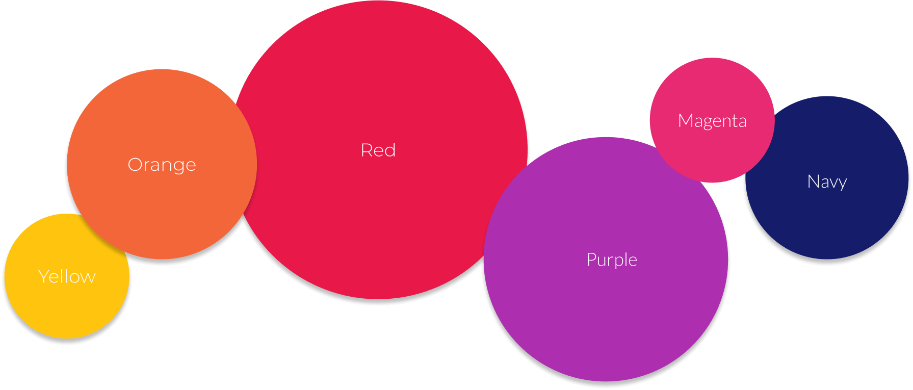
YELLOW
HEX: #FFC40E
CMYK: 0, 23, 95, 0
ORANGE
HEX: #F3663A
CMYK: 0,58,76,5
RED
HEX: #E81849
CMYK: 0,90,69,9
PURPLE
HEX: #AD2FAF
CMYK: 1,73,0,31
MAGENTA
HEX: #E82A72
CMYK: 0,82,51,9
NAVY
HEX: #151D6A
CMYK: 80,73,0,58
Website Design
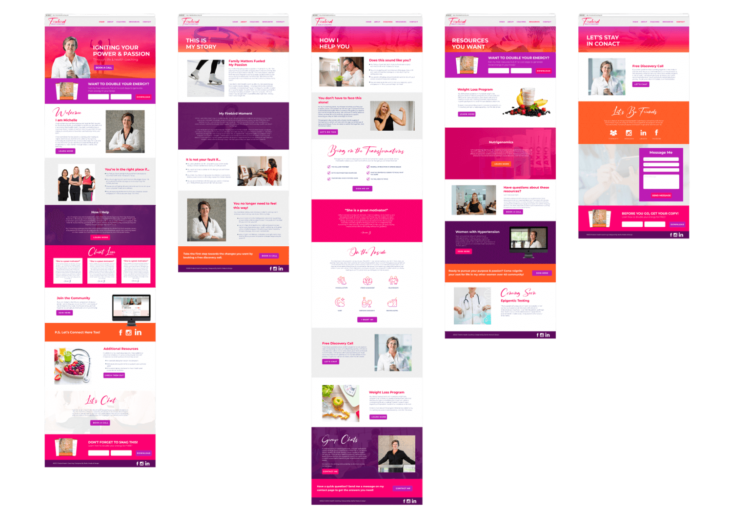
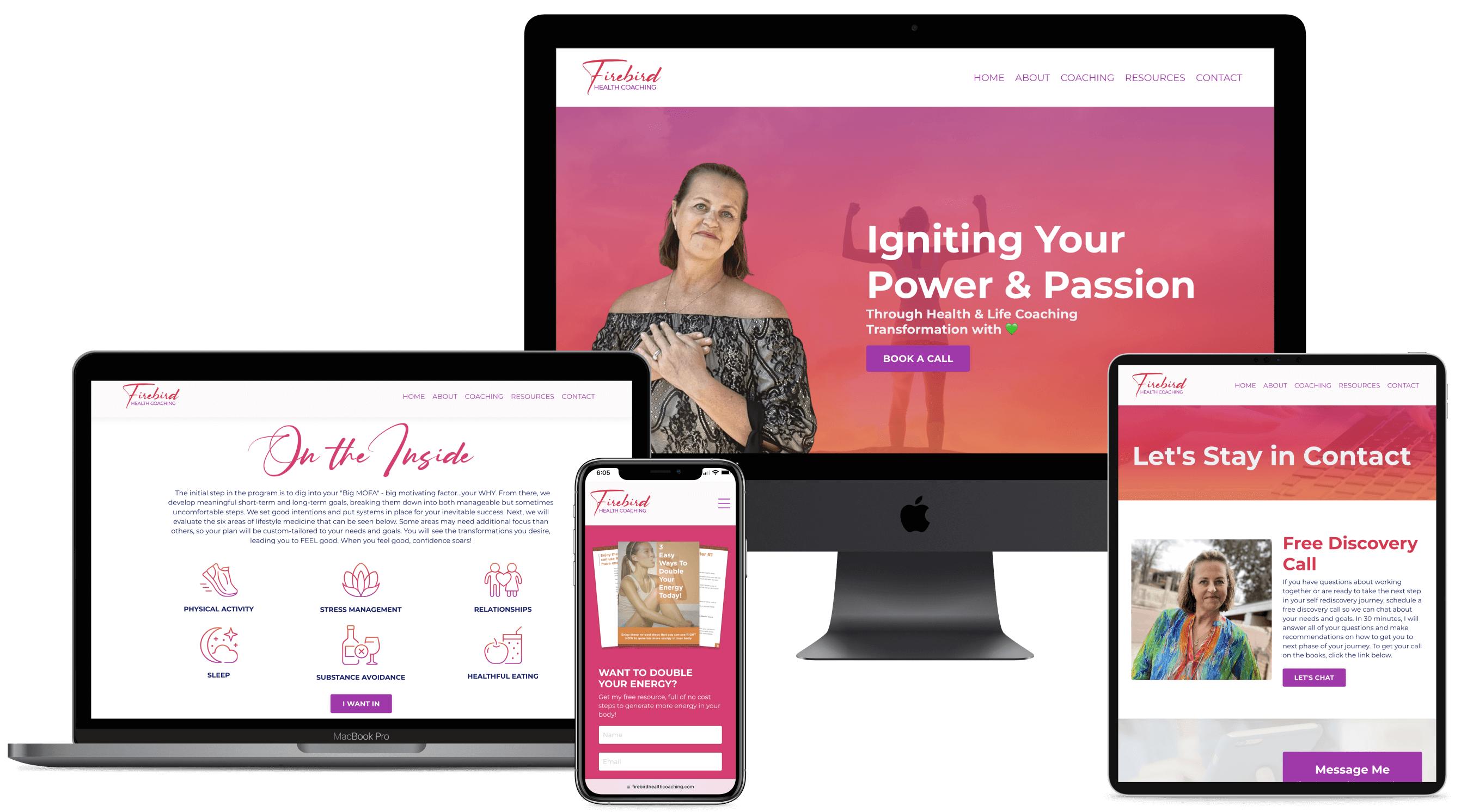
This website is built on Kajabi so that Michelle could have her email marketing and website all in one place and the potential to easily add on a members-only area or course section when she is ready to expand her business.
From her colorful backgrounds and accents to the vibrant imagery we chose, our goal for this site is to be vibrant, inspiring, yet still professional for her potential clients to connect with her easily.
– The Prototype –
– The Website –
LIKE WHAT YOU SEE?
You can be next!
Are you ready to lay the foundation for growth in your business by defining your brand and building a client-attracting website? The first step is to schedule a FREE consultation. We’ll discuss your business & brand vision in just 30 minutes. This no-commitment meeting is the perfect time to get the ball rolling on your creative & techy projects so that you can be my next client success story!
