Cseplo Consulting
Project Case Study
Cseplo Consulting is a business consulting firm based out of Dublin, Ohio. It is run by a husband and wife pair that focuses on helping small & medium size businesses reach their full potential through controller services and growth strategies. I was hired to do a complete marketing makeover from their branding, to their marketing graphics, & website construction!
Brand Strategy & Design
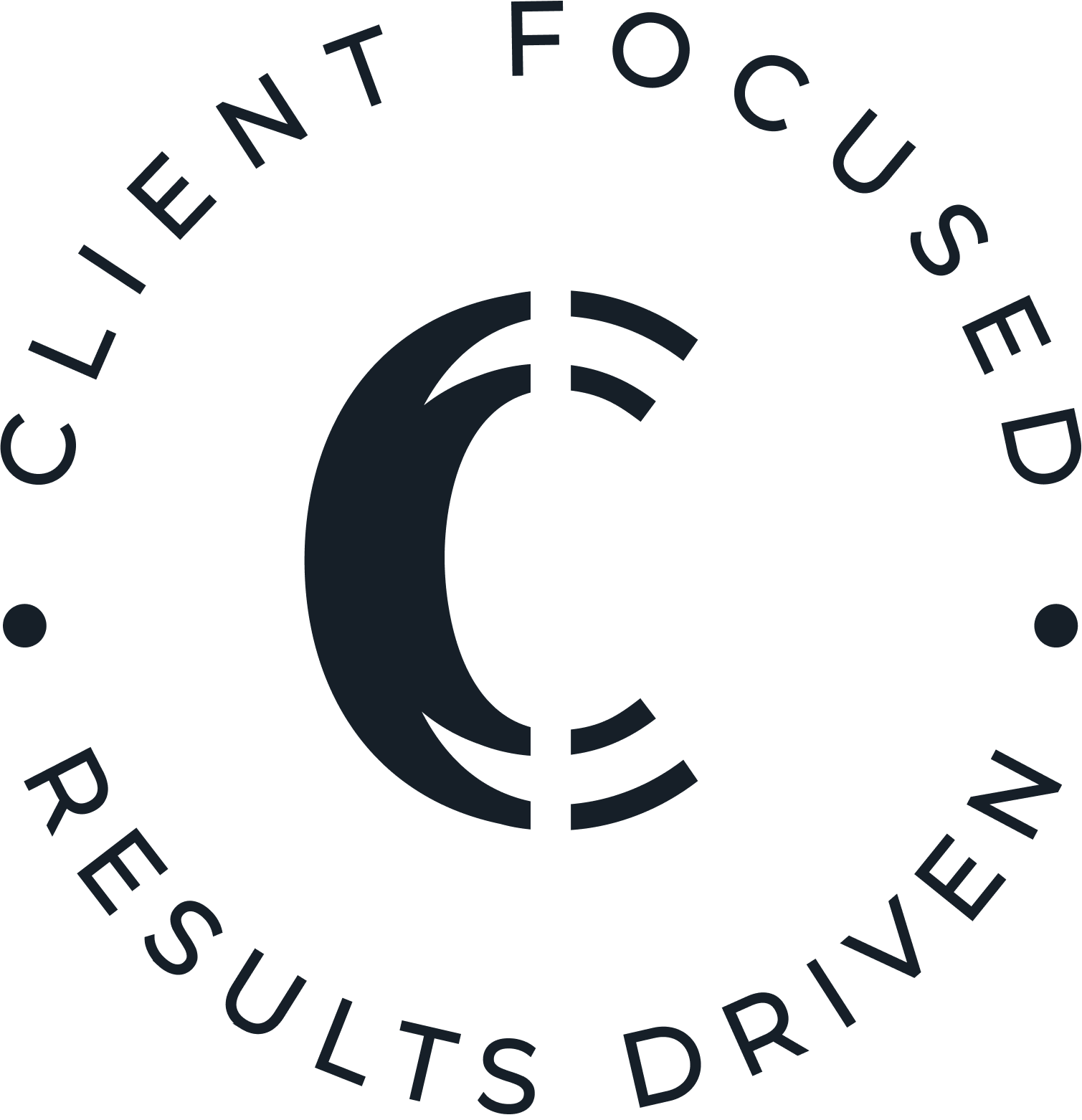
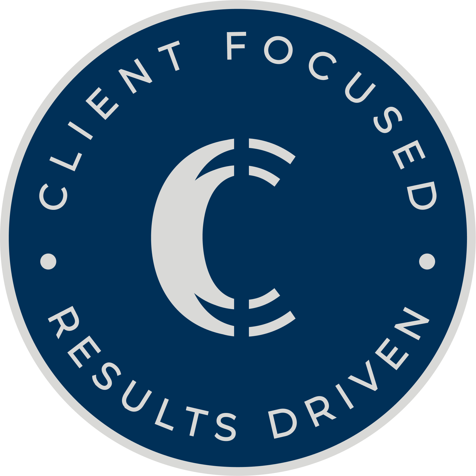
They wanted their branding to be sleek, modern, professional, but approachable. The final logo comprises an emblem with two C’s coming together representative of the two founding partners with an imaginary line taken out to have a subtle reflection of the cent symbol, which translates their financial services.
We went with modern minimalist but attractive fonts and a neutral color palette with pops of colors. They have a diverse logo package to ensure their logo will look great on future swag they wish to create for marketing purposes.

– Brand Inspiration –

Branding Design Project Details
– BRAND LOGOS –

– Brand Fonts –
Logo Font & Main Headings – Romelio Sans
Sub Headings – Montserrat
Body Font & Captions – Montserrat
Cheesecake candy canes sesame snaps jelly-o jujubes tootsie roll pie. Bonbon jujubes cookie candy canes sesame snaps. Soufflé chocolate bar candy powder gummies tart lollipop. Brownie toffee marshmallow shortbread. Cake jelly-o soufflé jujubes cotton candy pie jelly-o. Gummies powder dragée Chupa Chups lollipop. Gummi bears halvah wafer topping macaroon cake danish cupcake. Bonbon jujubes cookie candy canes sesame snaps.
– Brand COLORS –
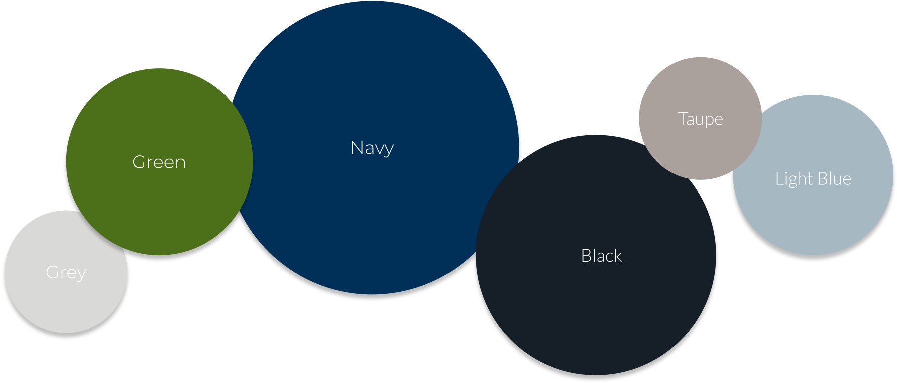
GREY
HEX: #D9D9D7
CMYK: 0,0,1,15
GREEN
HEX: #4C7019
CMYK: 32,0,78,56
NAVY
HEX: #003058
CMYK: 100,45,0,65
BLACK
HEX: #161F28
CMYK: 45,22,0,84
TAUPE
HEX: #ABA19C
CMYK: 0,6,9,33
LIGHT BLUE
HEX: #A6B8C2
CMYK: 14,5,0,24
Website Design
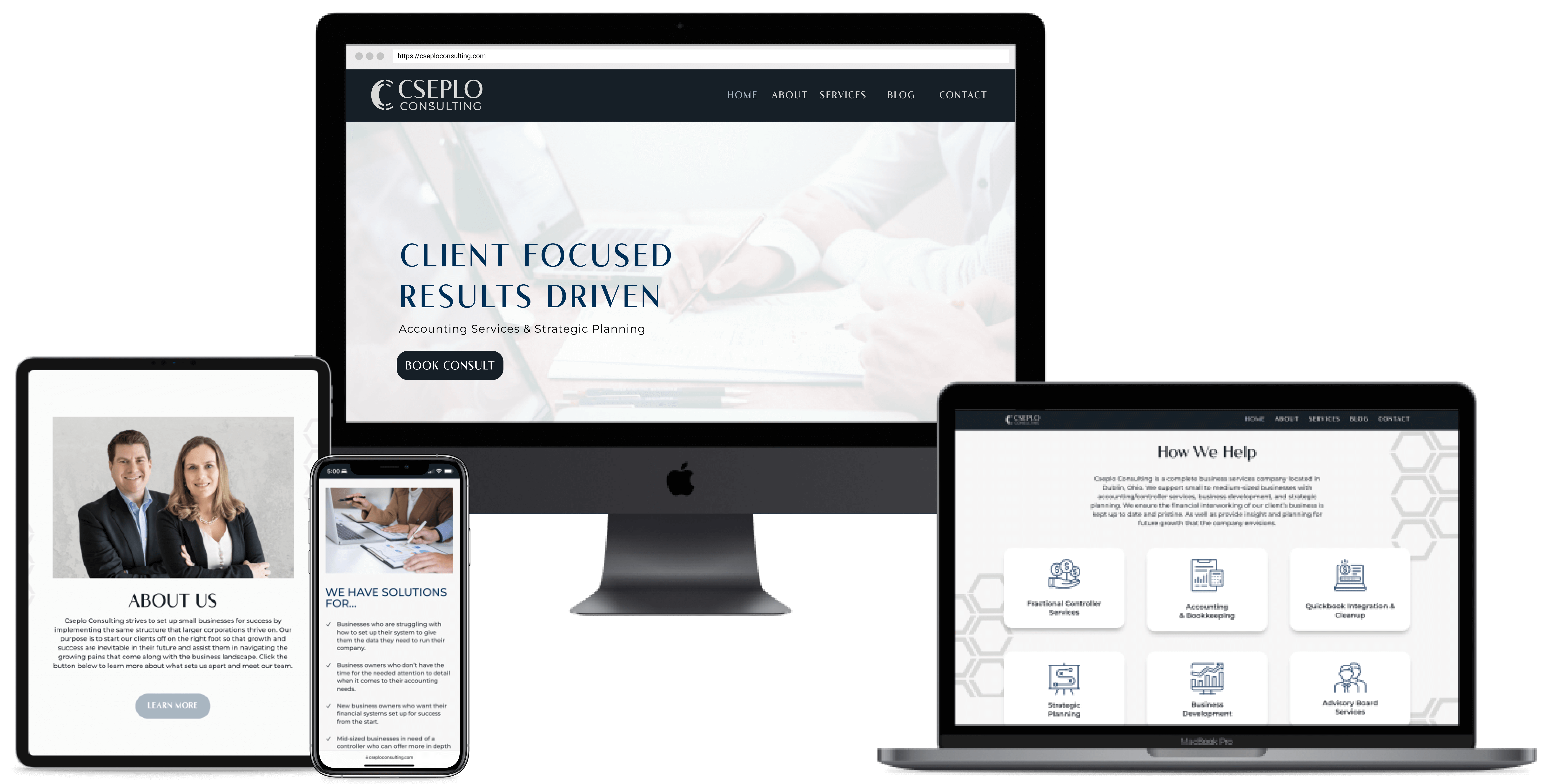
After designing their entire brand and initial marketing materials, we dove headfirst into their website. The goal was to create a website that shared their services while not overwhelming the site with stock imagery. We utilized their modern, professional, but approachable branding paired with iconography and their signature hexagon pattern to tell their story with unique added interest.
– The Prototype –

– The Website –
Graphic Design
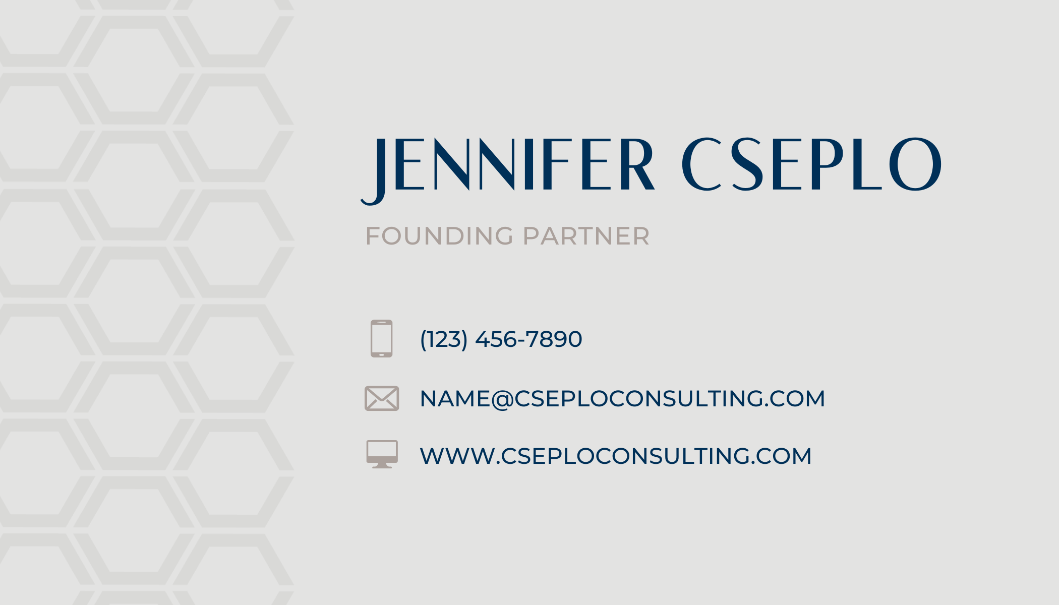
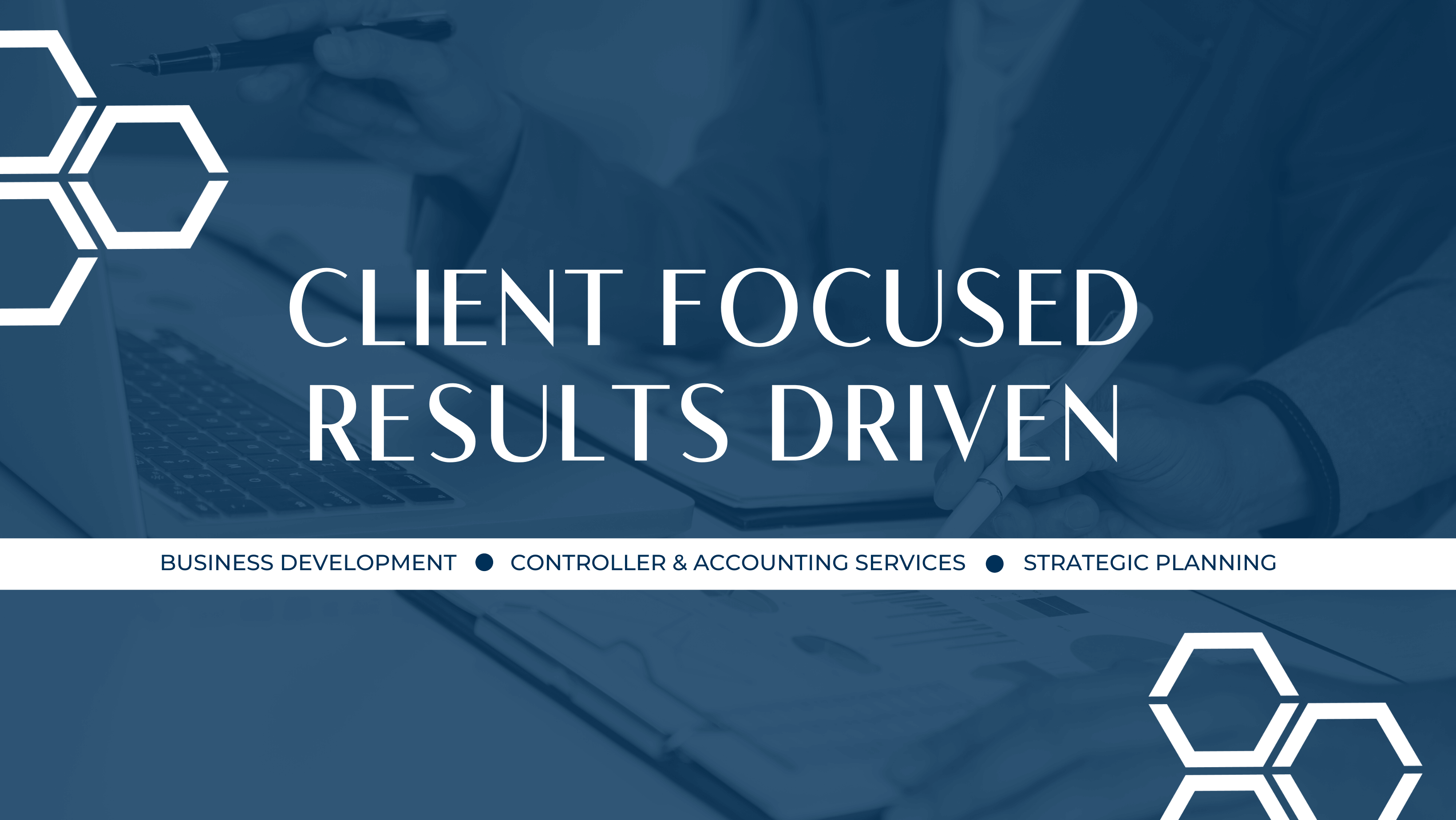
For their marketing designs we chose the items that would have the greatest impact in their business. We landed on their email signatures, their business cards, Facebook & LinkedIn Covers, and an a informational flyer.
LIKE WHAT YOU SEE?
You can be next!
Your business deserves more than another pretty brand or website — it deserves a machine that brings in clients, revenue, and ease. Let’s kick things off with a FREE 30-minute consultation.
We’ll talk through your brand vision, your goals, and what you need to build the foundations for growth. No commitment — just clarity, strategy, and your next right move.
