Kindred Tranquility
Project Case Study
Kindred Tranquility is the brand behind holistic wellness coach Erika Abatzis. She hired me to tackle her branding, a sales page for her new program and to set up the backend of her new coaching program in Kajabi.
Brand Strategy & Design
Fun & funky was the theme for this mini brand package I created for a new wellness coach client. She had a very clear idea of what she wanted, and even provided some examples she tried to develop herself, but asked me to make her vision a reality! The emblem is a mix of the medical symbol, a ying-yang, and a lotus flower to represent her nursing experience and her hippie holistic approach to wellness coaching. The concept was completely her own, which made her a great candidate for my new Brand Basic package, where my clients who know exactly what they want but need someone to execute can get professional branding at an affordable price! I refined her emblem idea, created a color palette based on what she liked, and selected funky fonts to complement the entire design.
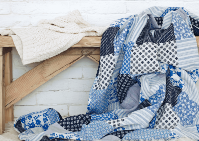
– Brand Inspiration –

– BRAND LOGOS –

– Brand Fonts –
Logo Font & Main Headings – Excalibur Nouveau
Sub Headings – Quattrocento Sans
Body Font & Captions – Quattrocento Sans
Cheesecake candy canes sesame snaps jelly-o jujubes tootsie roll pie. Bonbon jujubes cookie candy canes sesame snaps. Soufflé chocolate bar candy powder gummies tart lollipop. Brownie toffee marshmallow shortbread. Cake jelly-o soufflé jujubes cotton candy pie jelly-o. Gummies powder dragée Chupa Chups lollipop. Gummi bears halvah wafer topping macaroon cake danish cupcake. Bonbon jujubes cookie candy canes sesame snaps.
– Brand COLORS –

LAVENDAR
HEX: #DCC9F9
CMYK: 12,19,0,2
ORANGE
HEX: #FC741D
CMYK: 0,54,88,1
PURPLE
HEX: #593C84
CMYK: 33,55,0,48
TEAL
HEX: #22ABB4
CMYK: 81,5,0,29
NAVY
HEX: #194769
CMYK: 76,32,0,59
AQUA
HEX: #B0E6EA
CMYK: 25,2,0,8
Website Design
I created the entire sales funnel (sales page, payment gateway, email automation, and course setup) for Kindred Tranquility’s new program, 5 Elements of Essential Healing, in Kajabi. The goal for the sales page was to promote the program utilizing the “funky” branding we created. It is the first sign of how professional and intentional this program is and sets the tone for the holistic approach of the course with a clear call to action to book a free consultation with Erika.
– The Prototype –

– The Website –

Course Design
Take a peek at the inside of the course behind a paywall.
To ensure a seamless brand experience, I designed the entire program with on-brand graphics, imagery, buttons, fonts, messaging, and more to continue building on the funky, professional brand we created in the branding package phase and her marketing on the sales page.
– The Course –

Graphic Design
While I wasn’t hired to do marketing graphics for this project, when building a course, graphics are always needed. My goal is to have every touch point with a prospect or client be branded, which means the course backend should also be on brand. Check out some of the graphics for the 5 Elements of Essential Healing Program course modules.


LIKE WHAT YOU SEE?
You can be next!
Are you ready to lay the foundation for growth in your business by defining your brand and building a client-attracting website? The first step is to schedule a FREE consultation. We’ll discuss your business & brand vision in just 30 minutes. This no-commitment meeting is the perfect time to get the ball rolling on your creative & techy projects so that you can be my next client success story!