Mitered Corner Quilting
Project Case Study
Trisha, the owner of Mitered Corner Quilting, sought help to round out her brand and get her free offer & masterclass funnels up and running. As a new business owner who was hesitant with the tech setup, she contacted me to help her get her all set to start growing her business online. Look at how I helped this quilting coach get her online presence up and running!
Brand Strategy & Design
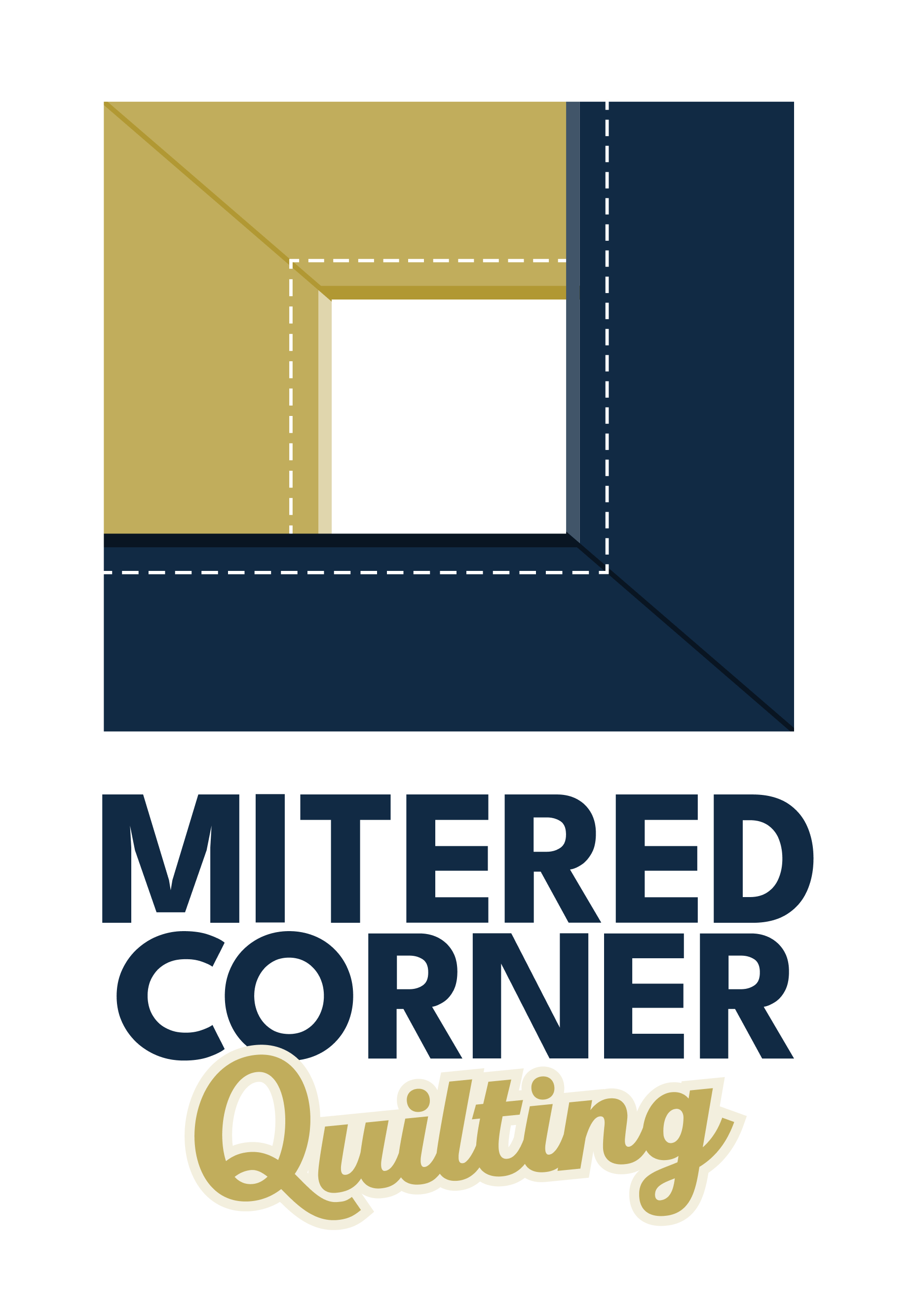
Trisha had one logo previously designed for her and her mitered corner emblem but wanted a variety she could use going forward. She also needed to learn the colors she should be using for her marketing and wanted a different font pairing that would be more versatile online since her original fonts were Adobe fonts. I gave her a variety of logos, created a professional yet friendly color palette, and settled on Google fonts that could be used in Canva and her funnel-building platform.
– Brand Fonts –
Logo Font & Main Headings – Mercia Script
Sub Headings – Poppins SemiBold
Body Font & Captions – Lora
Cheesecake candy canes sesame snaps jelly-o jujubes tootsie roll pie. Bonbon jujubes cookie candy canes sesame snaps. Soufflé chocolate bar candy powder gummies tart lollipop. Brownie toffee marshmallow shortbread. Cake jelly-o soufflé jujubes cotton candy pie jelly-o. Gummies powder dragée Chupa Chups lollipop. Gummi bears halvah wafer topping macaroon cake danish cupcake. Bonbon jujubes cookie candy canes sesame snaps.
– Brand COLORS –
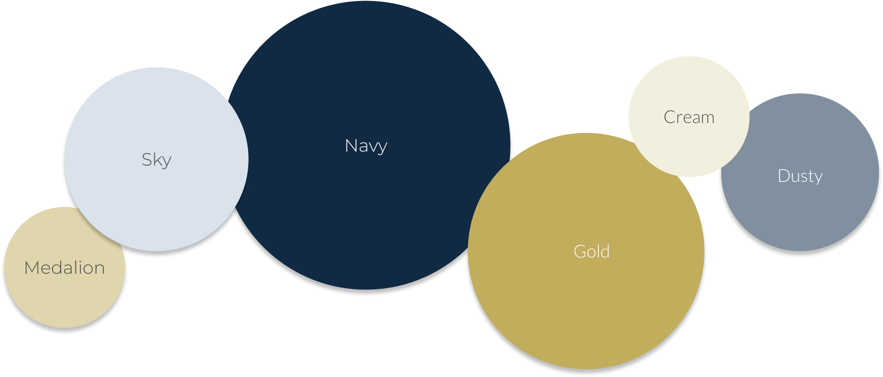
MEDALION
HEX: #E0D6AD
CMYK: 0,4,23,12
SKY
HEX: #DAE3EC
CMYK: 8,4,0,7
NAVY
HEX: #112A44
CMYK: 75,38,0,73
GOLD
HEX: #C1AD5C
CMYK: 0,10,52,24
CREAM
HEX: #F3EFDE
CMYK: 0,2,9,5
DUSTY
HEX: #8090A0
CMYK: 20,10,0,37
Website & Funnel Building
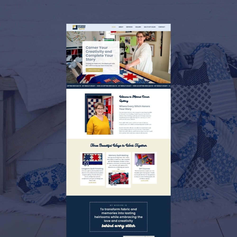
We helped Trisha build her entire online presence — including her website using The Virginia Template from our Systeme.io shop, plus all the funnels to support her quilting business. This included her freebie opt-in funnel, Amazon storefront page, masterclass registration funnel, course sales page, and the backend setup for her five-week quilting course. Her main goals were to launch a free resource to start generating leads and host a live masterclass that sold her new program — and now, everything runs seamlessly through Systeme.io. You can view her website and one of her sales funnels below.
– The Home Page –

– The Course Sales Page –

Graphic Design
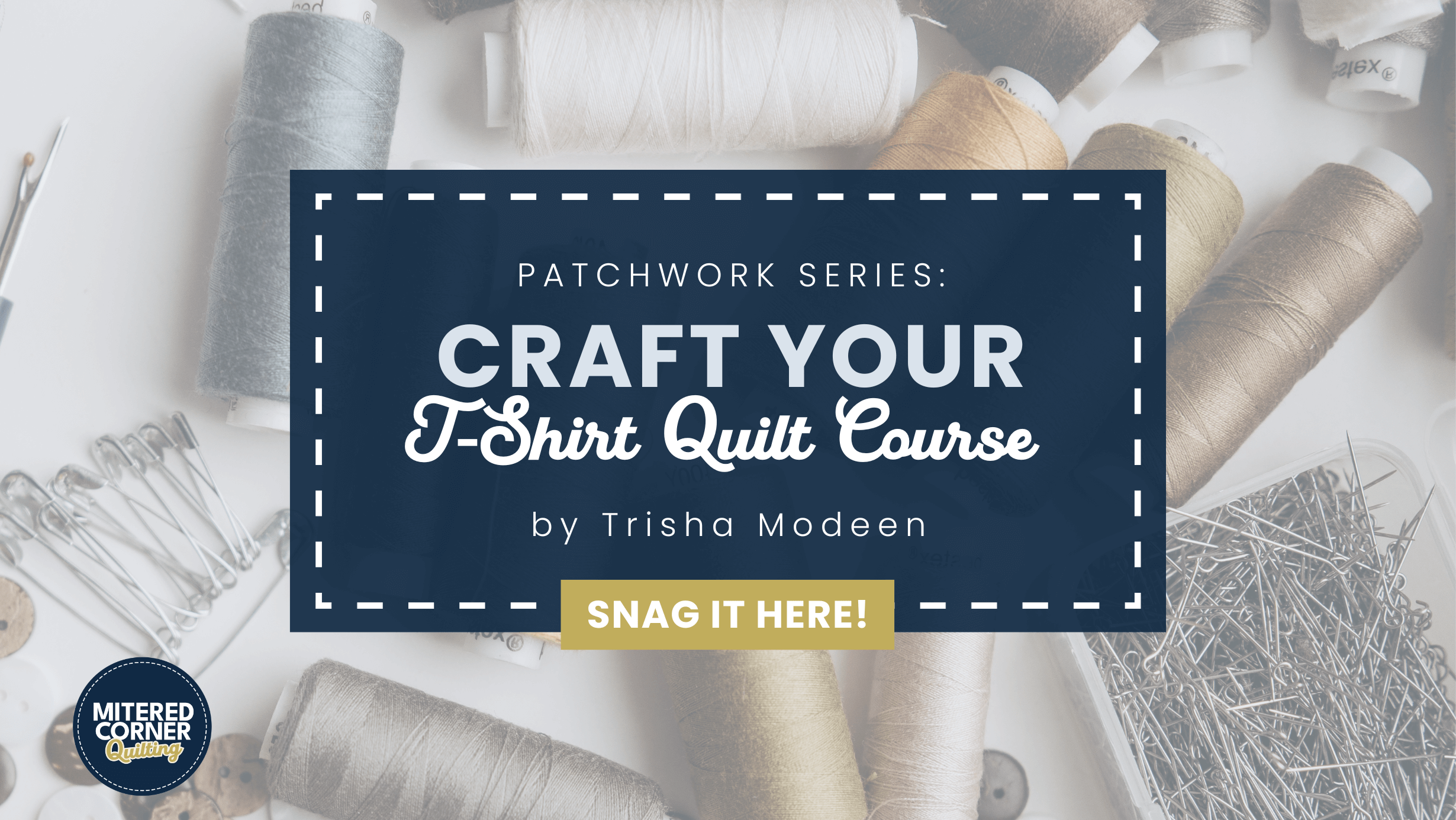
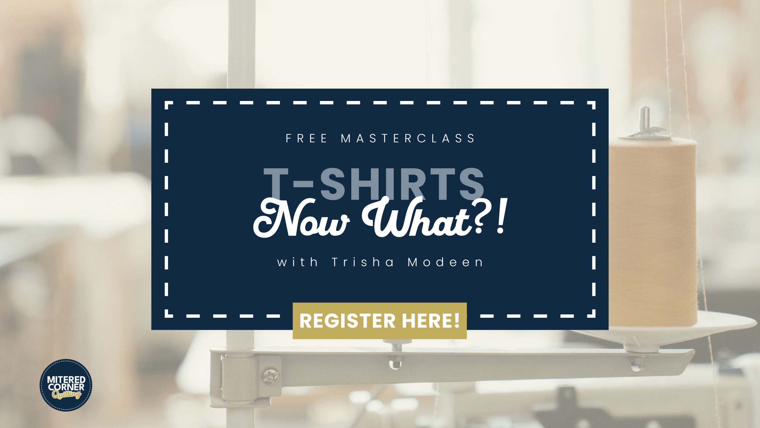
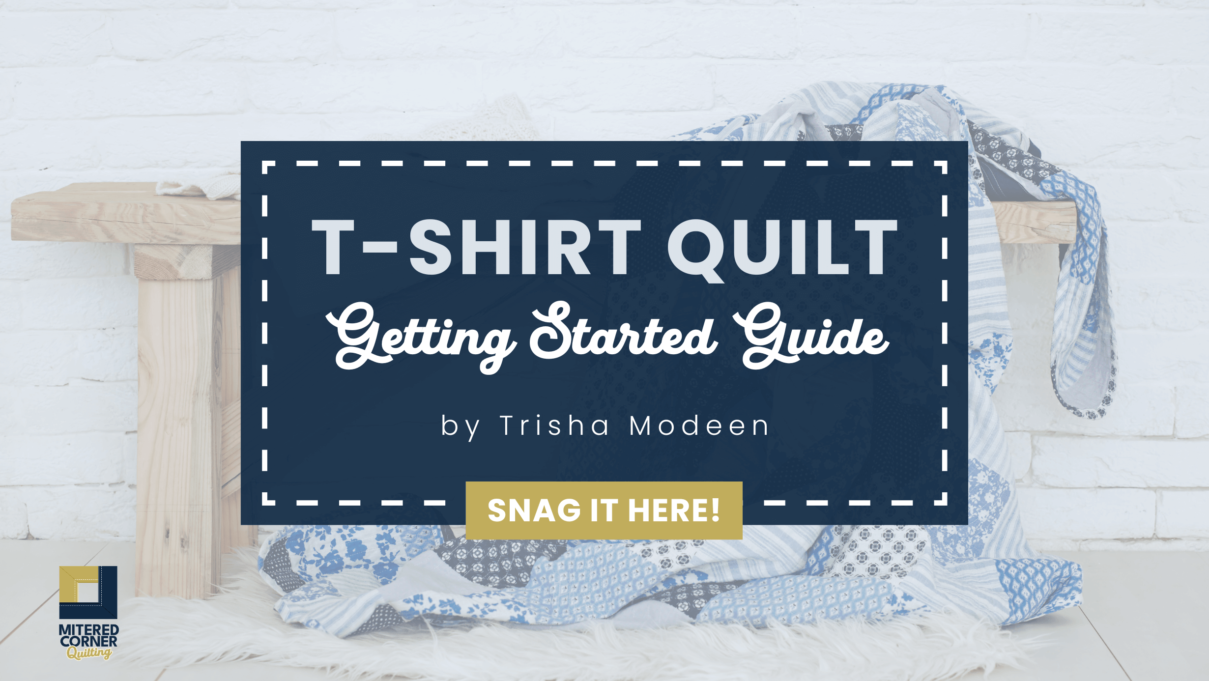
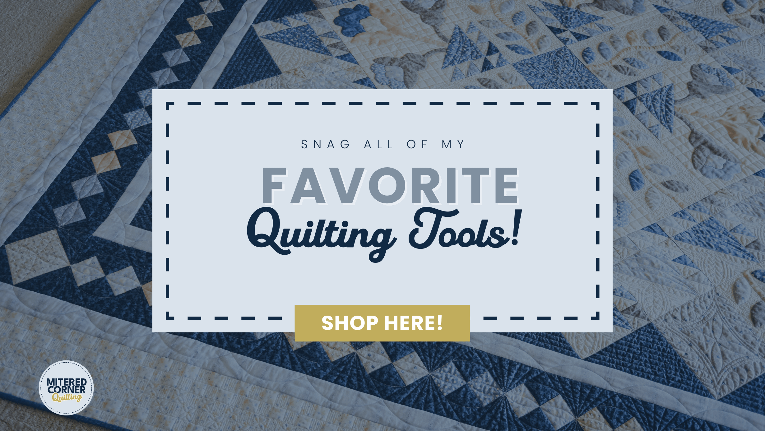
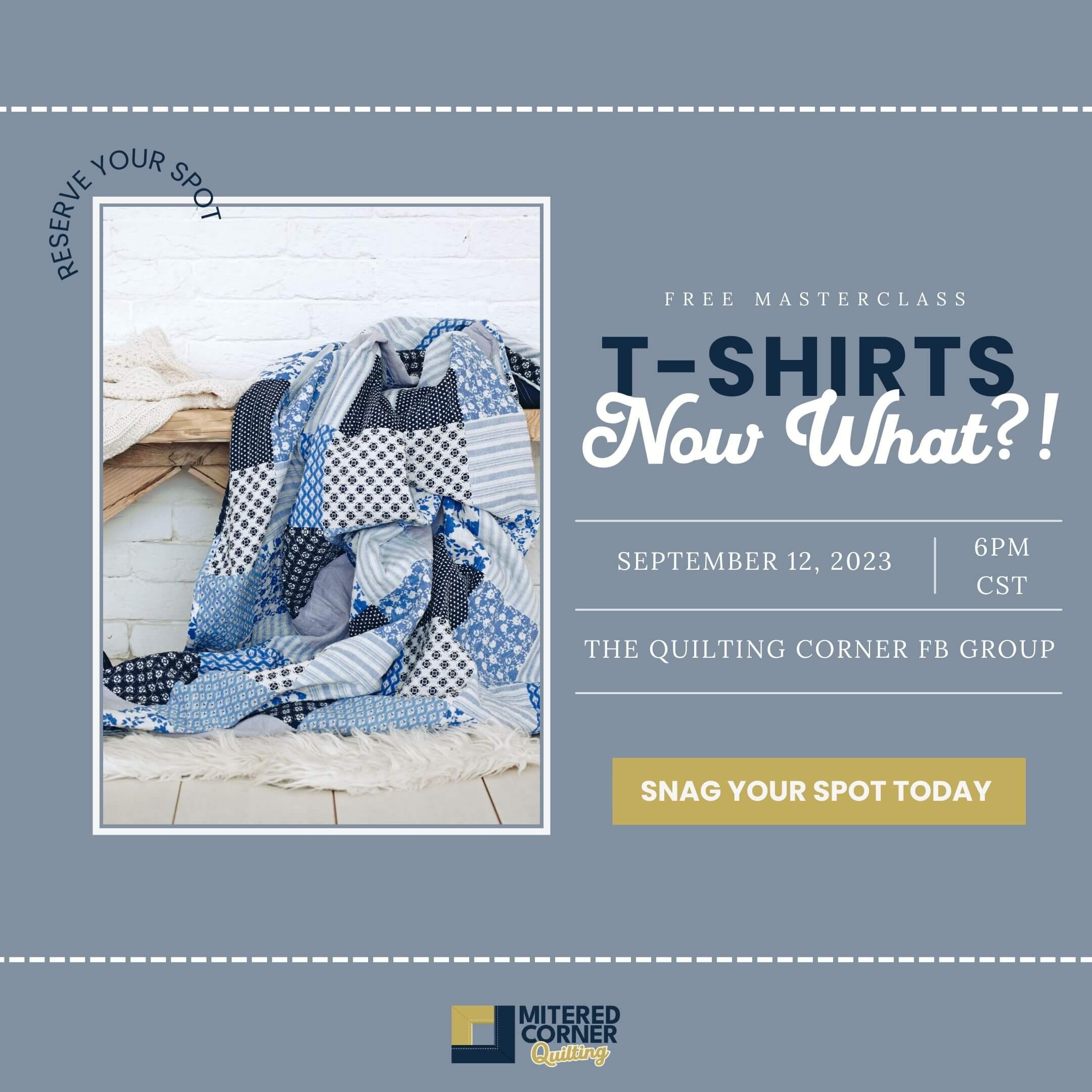
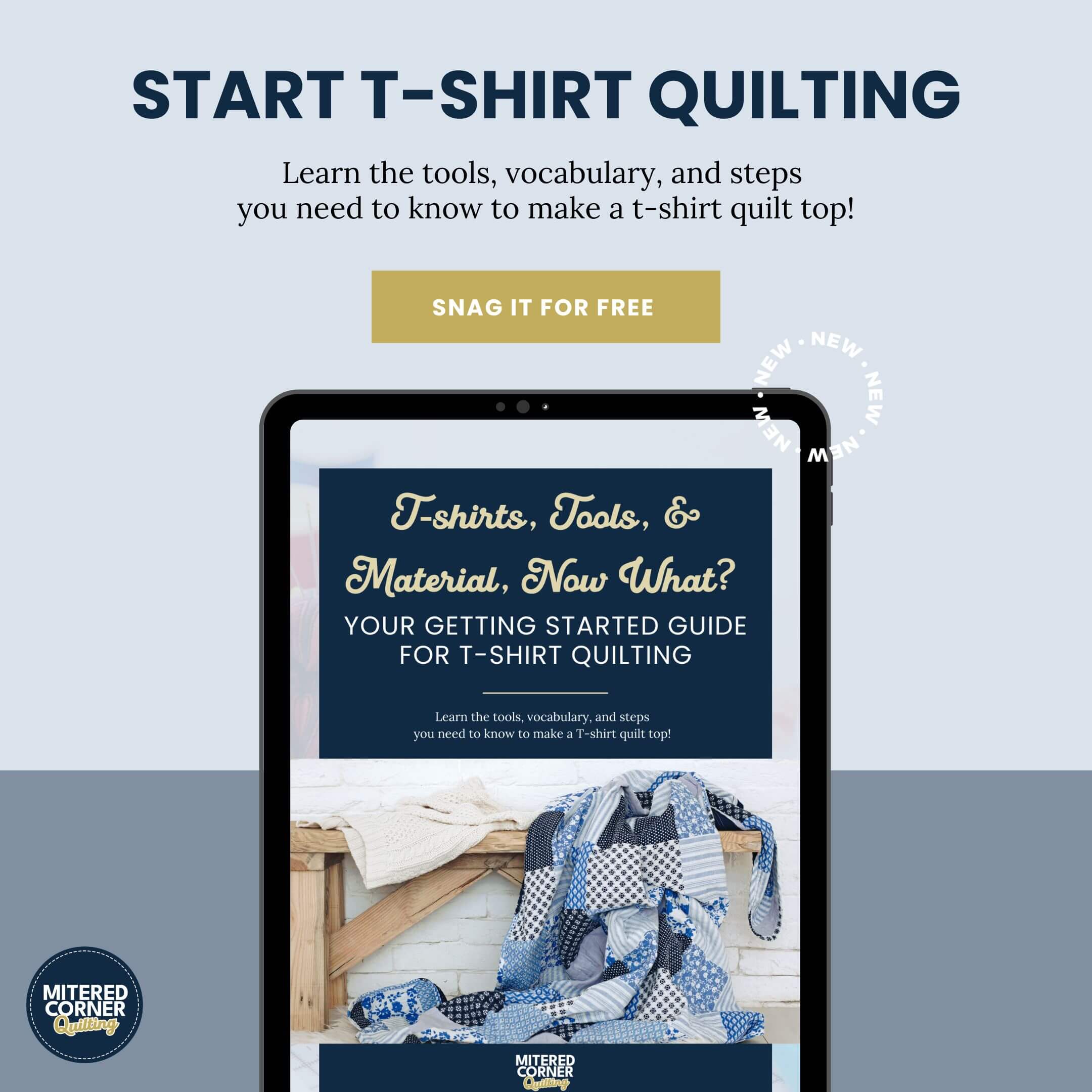
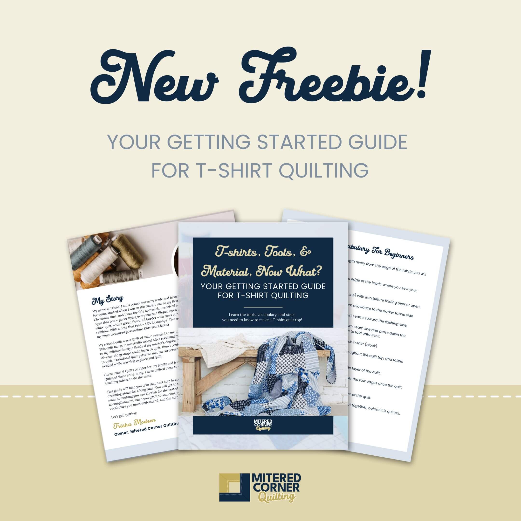
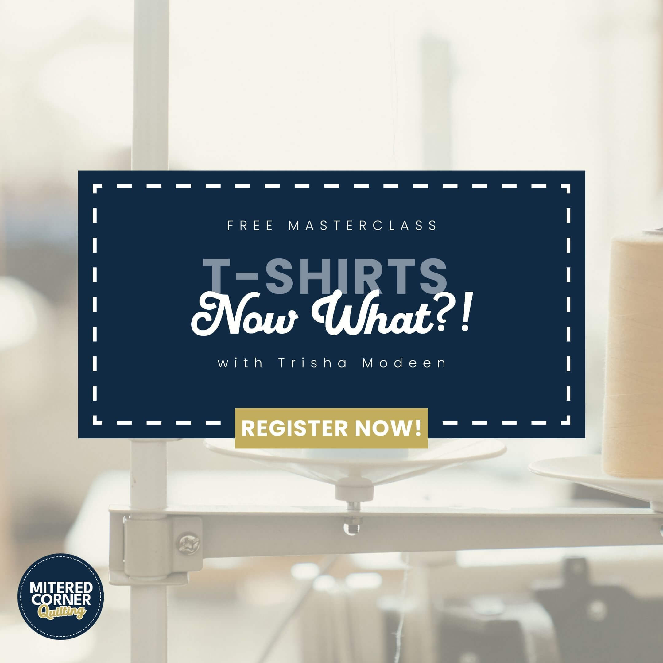
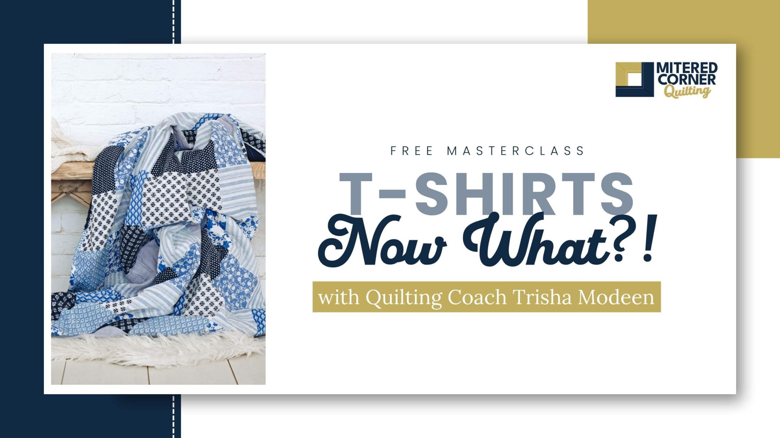
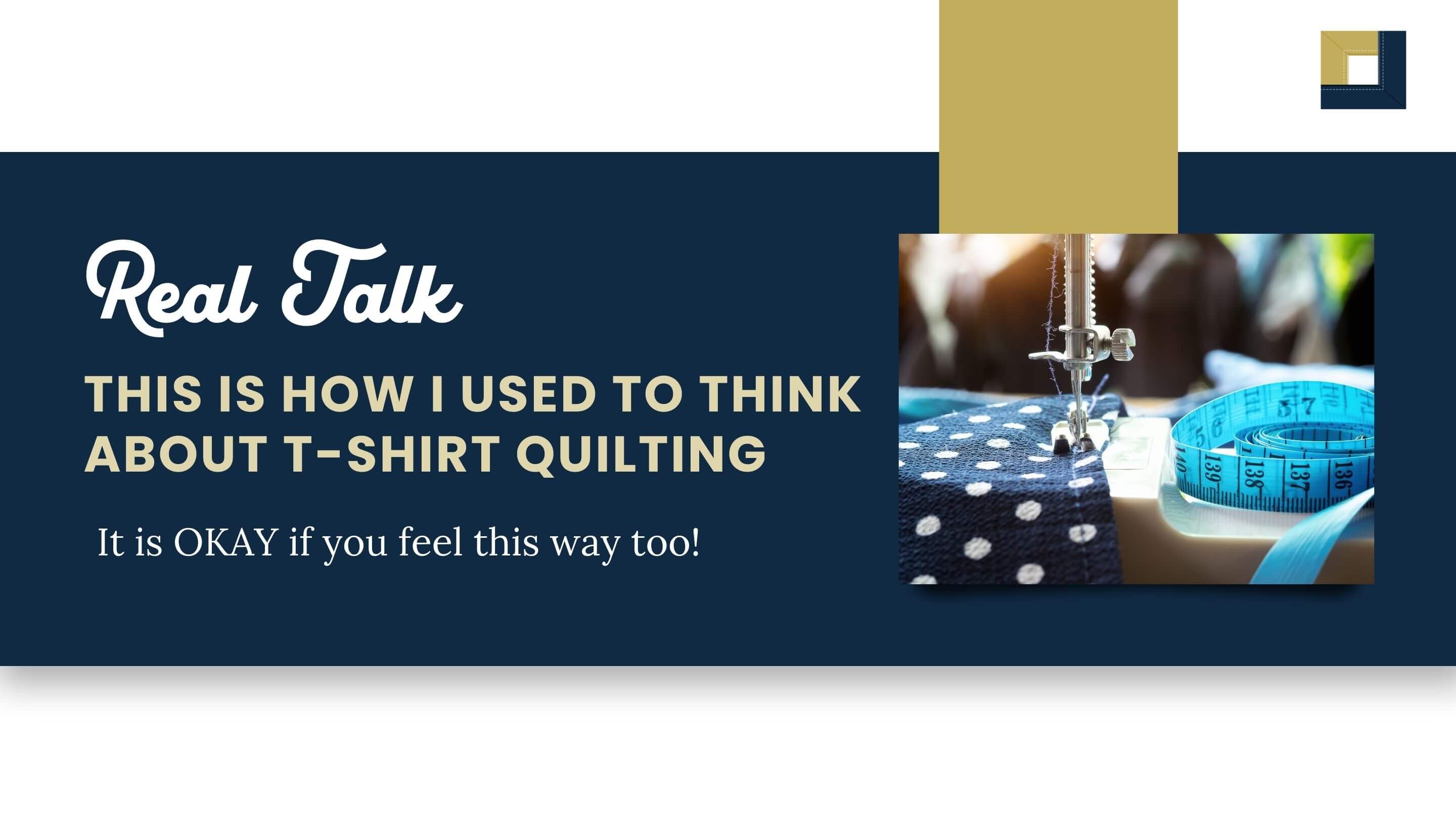
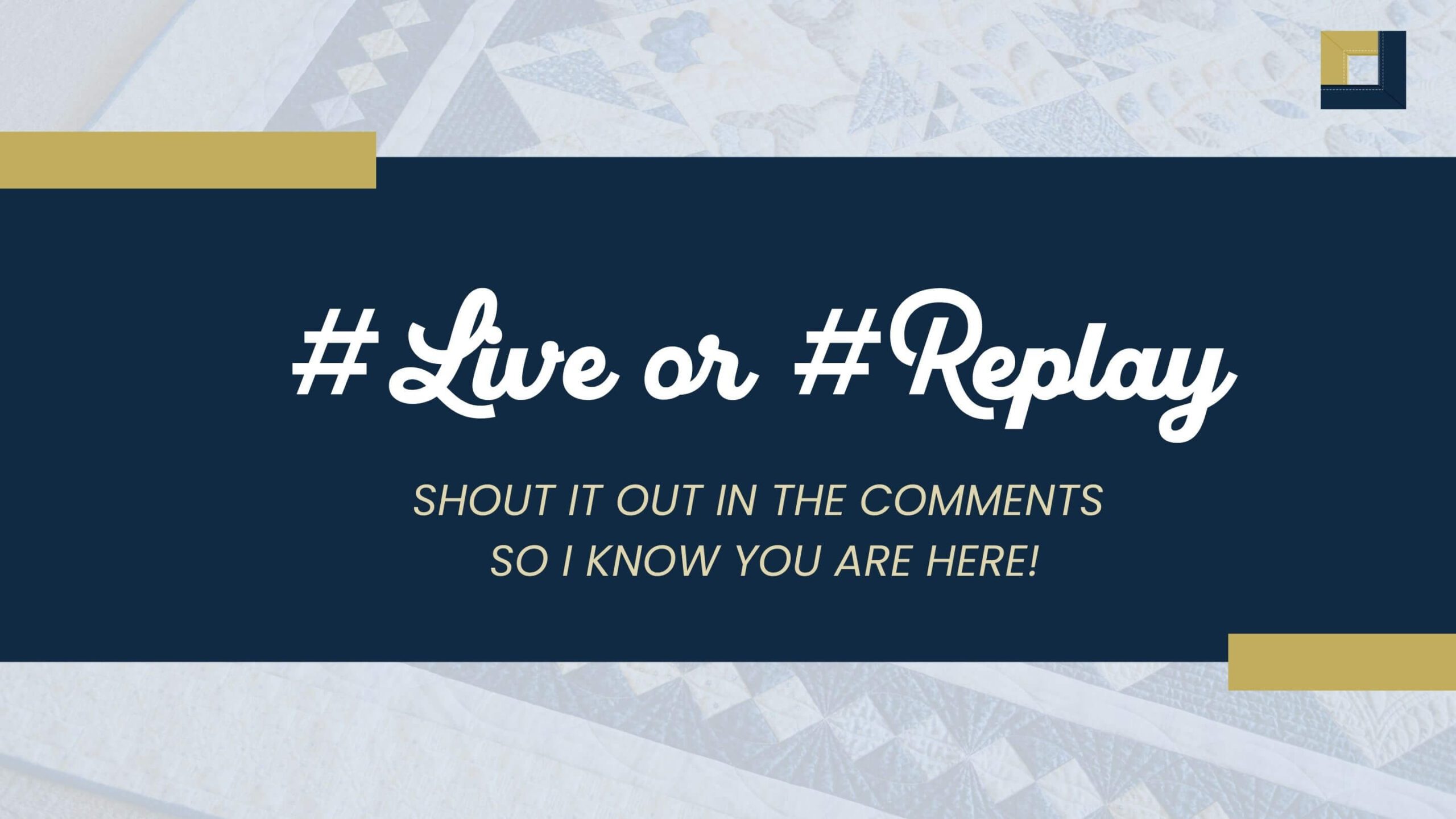
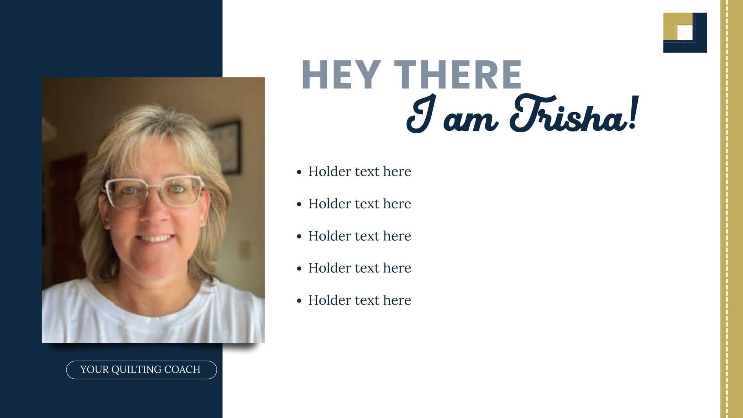
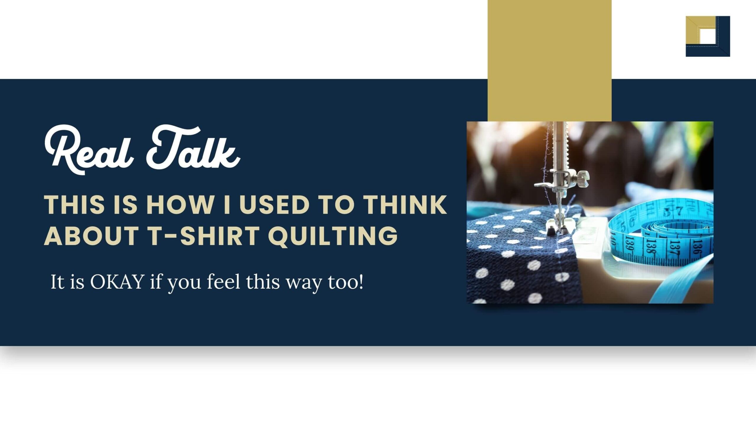
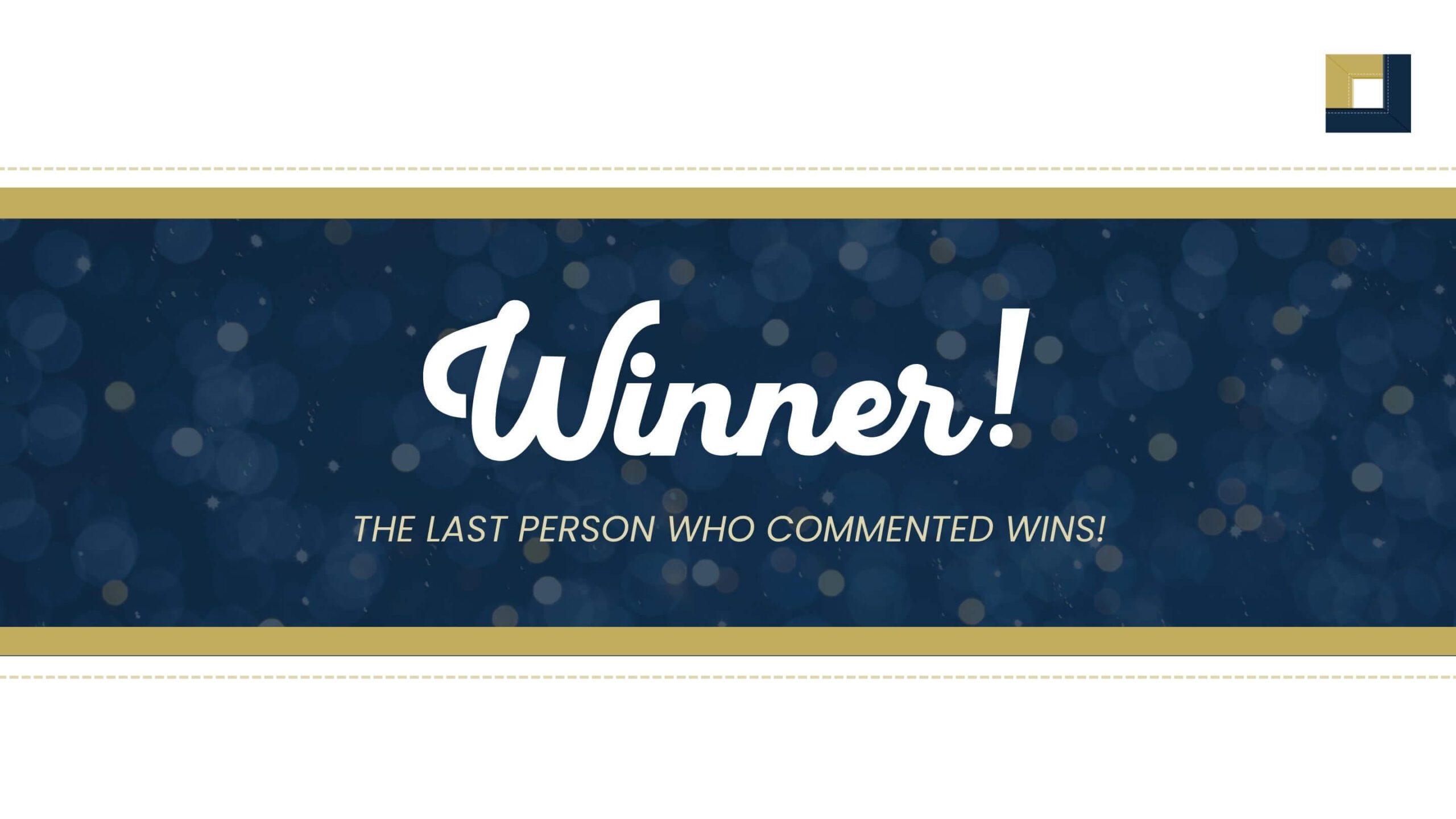
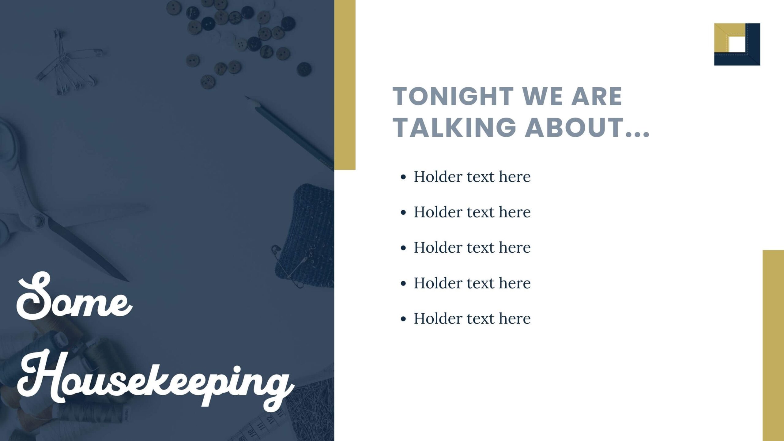
To build out the tech and all of her offers, strategic graphics had to be made, including marketing graphics for her freebie and masterclass, thumbnails for all the links she will be sharing, and a set of slide deck templates for her masterclass content.
LIKE WHAT YOU SEE?
You can be next!
Your business deserves more than another pretty brand or website — it deserves a machine that brings in clients, revenue, and ease. Let’s kick things off with a FREE 30-minute consultation.
We’ll talk through your brand vision, your goals, and what you need to build the foundations for growth. No commitment — just clarity, strategy, and your next right move.
