Are you ready to boost your sales page’s effectiveness and attract more ideal clients?
A well-crafted sales page is your digital storefront, and it’s crucial to have it optimized for conversions. If you’re not seeing the results you want, it might be time to take a closer look.
In this post, we’ll dive into 5 common mistakes that can hinder your sales page’s effectiveness.
1.) Lack of Clarity in Your Value Proposition
Your value proposition is the core message that answers the question, “Why should I choose your product or service?” If it’s unclear or generic, potential customers will struggle to understand the benefits of working with you.
Make sure your value proposition is:
- Concise: Keep it short and sweet. For example, instead of saying “We offer a variety of branding services,” try “We create brands that attract your dream clients.”
- Compelling: Highlight the unique benefits you offer. For instance, instead of saying “We have a team of experienced designers,” say “Our award-winning designers will create a brand that sets you apart.”
- Customer-centric: Focus on how your product or service solves your customers’ problems. For example, instead of saying “We provide website development,” say “We build websites that generate leads and increase sales.”
2.) A Weak Headline
Your headline is the first thing visitors see, so it needs to be attention-grabbing and relevant. A weak headline can lead to a high bounce rate and lost sales.
A strong headline should:
- Be specific: Clearly state what your product or service is. For example, instead of saying “Our services,” try “Branding and Website Design for Female Entrepreneurs.”
- Create curiosity: Intrigue your audience with a question or a promise. For example, instead of saying “We offer branding packages,” try “Tired of generic branding? Let’s create something truly unique.”
- Include a benefit: Highlight the main advantage of your offering. For example, instead of saying “We design websites,” try “We design websites that convert visitors into customers.”

Need to learn how to DIY a sales page that will still convert!
Then I invite you to my FREE Successful Sales Page Secrets masterclass, where I will break down the step-by-step strategy I use to build high converting sales page that convert browsers to buyers on autopilot! Register below!
3.) A Lack of Social Proof
Social proof, such as testimonials, reviews, and case studies, can significantly boost your credibility and build trust with potential customers.
Consider Including:
- Customer testimonials: Share positive experiences from satisfied clients. For example, “Working with [Your Company] was a game-changer for my business. Their expertise helped me attract my ideal clients and grow my revenue.”
- Case studies: Showcase successful projects or results. For example, “We helped [Client Name] increase their website traffic by 30% and generate over $10,000 in new sales.”
- Awards or certifications: Highlight any industry recognition you’ve received. For example, “We are proud to be a certified [Certification Name] agency.”
4.) Complex Buying Process
If your buying process is too complicated or confusing, potential customers may abandon their purchase. Keep it simple and straightforward to maximize conversions.
Tips for a streamlined buying process:
- Clear calls to action: Use strong, persuasive language to guide visitors towards the desired action. For example, instead of saying “Click here to learn more,” try “Ready to transform your business? Book a free consultation today.”
- Limited options: Offer a limited number of options to avoid overwhelming customers. For example, instead of offering a dozen different packages, offer a few carefully curated options that cater to different needs.
- Secure checkout: Ensure a safe and secure checkout process. Use a reputable payment processor and display trust seals to reassure customers.
5.) Poor Mobile Optimization
With more and more people browsing the web on their smartphones, it’s essential to have a mobile-friendly sales page. A poorly optimized page can lead to a frustrating user experience and lost sales.
Make sure your sales page:
- Loads quickly: Optimize your images and code for faster loading times. Use tools like Google PageSpeed Insights to identify areas for improvement.
- Is easy to navigate: Use a responsive design that adapts to different screen sizes. Ensure elements are easy to tap and that the page layout is clear and intuitive.
- Has clear calls to action: Ensure buttons and links are easy to tap and that they are prominently displayed on mobile devices.
Let’s Wrap It Up
By addressing these common mistakes and implementing the strategies outlined in this guide, you can create a sales page that effectively attracts and converts your ideal clients.
Remember to keep your brand voice consistent throughout the page and test different elements to see what works best for your audience.

Don’t miss this opportunity to elevate your sales!
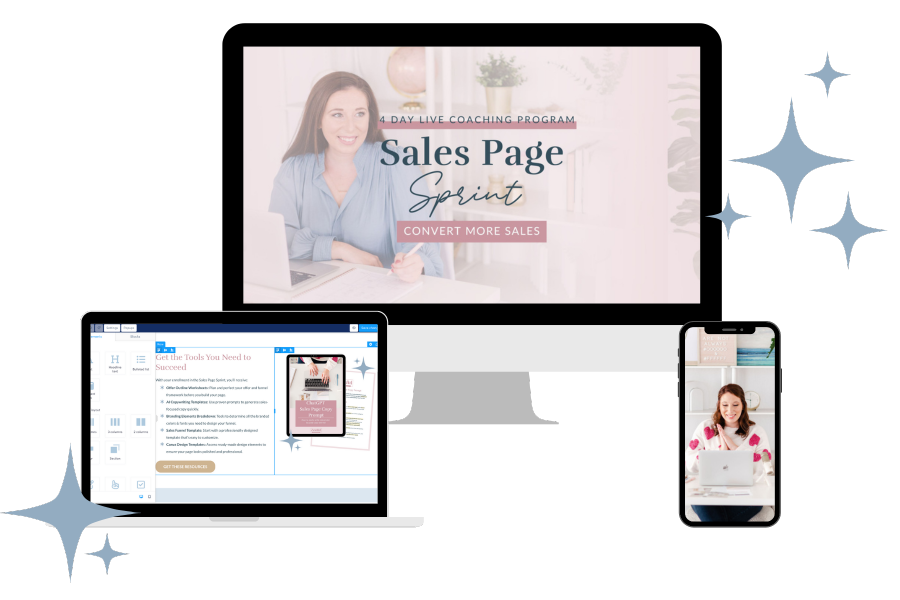
Enroll in my Sales Page Sprint and gain access to exclusive resources, expert guidance, and personalized feedback to unlock your sales page full potential. Secure your spot today!


