Stop picking your favorites.
A big problem I see small business owners make is that they they pick their favorites when it comes to the colors for their branding. They choose what they like and disregard that colors have different meanings. Instead of using these meanings to their advantage to craft a clear brand personality that will resonate with their audience, they pick what they like and leave it at that. This is a big misstep because the colors you choose for your brand can have a significant impact on how your customers perceive your business. Color has the power to evoke emotions and influence behavior, making it a crucial element of your brand’s identity. Here are the basics of color psychology for branding your small business:
#1 – Understanding Color Meanings:
Different colors have different meanings and connotations. For example, red is often associated with excitement, energy and passion, while blue is often associated with trust, stability and calm. It is important to understand the meanings and connotations of the colors you are considering for your brand.
#2 – Choosing the Right Colors:
The colors you choose for your brand should reflect your business values, mission and target audience. For example, if your business is focused on health and wellness, green, a color associated with nature and growth, might be a good choice.
#3 – Creating a Color Palette:
Once you have selected the colors that are right for your brand, it is important to create a color palette. A color palette is a set of colors that will be used consistently across your brand materials, including your website, business cards, signage and marketing materials.
#4 – Complementary Colors:
When creating your color palette, it is important to consider the relationship between the colors you have chosen. Complementary colors are colors that are opposite each other on the color wheel and create visual balance when used together.
#5 – Consistency is Key:
Consistency is key when it comes to using color in your branding. It is important to consistently use the same colors across all your brand materials to create a strong and recognizable brand identity.
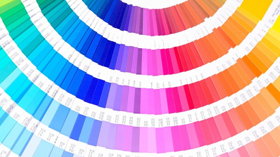
Need a visual of all of this?!
For a more visual representation of all of this, check out a clip from my recent Brand to Stand Out masterclass, where I address why choosing your brand personality first is important and how you can then go on to choose the correct colors . I also give you some great color & personality trait charts for you to review. You can view it by watching the short video below.
If you want to see the complete masterclass to learn about everything you need to know about having a successful branding tool kit, and all of the other crucial details, you need to understand about setting up your brand to resonate with your clients, then REGISTER FOR THE FULL FREE MASTERCLASS HERE.
In conclusion:
Do you see why establishing a personality & picking brand elements that match (like your colors) matters? The level of intentionalism it will bring to your marketing is worth it alone! Plus, you can’t afford to be the business that people are passing up left and right because you don’t look and feel the part.
To learn everything you need to know about establishing your brand so that you can create marketing with the fullest potential to grow your audience and sales, access the replay of the full Brand to Stand Out masterclass for free below!
Video Transcript:
0:00 All right. So let’s talk about talking more of like personality, color is picking fom stuff. We’re about to dive in right now. 0:11 So first you need you want your audience to c your personality first. Okay, thinking like why is defi there’s several reasons by m right now. 0:27 The first one is p with people. So giving your b get more relatable and more your clients. Okay. The s your personality treats us should foreshadow how you will r handle your clients in the show you examples of this. 0:47 So let’s say you are wanting to helps coach. You want to, I whatever it is. You want to get you to get more of a kind of a different style out there. 1:00 And there are all of those styles should be branded differently. Every business should be branded differently. Okay. So I’m just going to do kind of two styles of health coaches. 1:10 Let’s say there’s one style is like a military like boot camp drill sergeant type like this is more of like a kick in the pants, tough love, like no mercy type of training. 1:20 You’re definitely going to get results. But do you actually like a personal trainer while you’re working out? I’m not sure. 1:26 Okay. There’s that style of coaching. There’s also like the fitness support system bestie. That’s person is like demonstrating with you and maybe working out with you. 1:36 They’re giving you high fives. They’re being more encouraging. They are saying like you got this girl like there they are holding your hand every step of the way. 1:45 Okay. Now let me know in the comments. Are you more of the boot camp style or the the other one? 1:51 I’m not sure if higher coach. Let me know in the comments. Okay. Well, we’re in the military boot camp style. 2:00 I would pick a brand and I didn’t make these two brands and I’m about to show. When he says bestie, for sure, I’m kind of in the bestie line. 2:07 Even though I could probably use a military boot camp everyone’s in a while. If you’re in the military boot camp style, I’m going to show you how to do a new style of the type of client that I want to attract because that’s the type of coaching I do. 2:27 If I had a fun, lovey, easygoing brand and then I was a drill sergeant, people would be like, I don’t like them. 2:36 Our personalities don’t clash. This is not what I thought I was signing up for. So they’re not going to renew. 2:40 They’re not going to become raving fans. So your branding needs to match how you’re going to serve your clients later on. 2:47 For the best friend, I’m going to use a letter color as a more feminine. I’m going to use a script because it’s more fun-loving. 2:53 There’s a heart in this logo. It’s going to give that more like fine feminine, bestie vibe than this one does. 3:02 Does that make sense? Let me know in the comments. So knowing what your personality is up front can help you make the right selections for everything else down the line. 3:18 Okay. Absolutely. It says great. Okay. Great. Yes. Awesome. Okay. So once you know what your personality, what’s next? What are you doing next? 3:27 Well, you have to figure out what your color palettes are. So you have to match your personality with those colors. 3:34 Okay. And the example for the next several slides is my one of my coaching clients. She is actually a joy coach or burnout coach. 3:42 Her podcast is called the joy person thatY had added that the out history and art color theory and do really deep deep deep d brand color or like the main color they are resonating with the appeal to and what they mean. 4:39 Culture, the what we perceive states could also be very d culture is in like Asia or some world. So just make sure that you’re trying to target your and she is a burnout coach who’s all about joy and pos positivity who primarily works obviously picked pink for the we picked oranges and yellows warm 5:05 and optimists who can vibe. Okay. And disclaimer, whenever you Google color theory, there’s always going to be positive terms for every color and negative terms for every color because the stage like every disease or foundation for diseases has a color that they tie to it. 5:22 So just know that there’s going to be positive and negative emotions for every single color out there. But some other examples of this for like major companies out in the world, you can see all what these colors stand for and then all of the colors that go underneath. 5:39 So pink is definitely feminine. Purple is definitely distinguished and royal. So it makes sense that homework is there and pink is Barbie like it all makes sense. 5:47 If you were to read all of these less than then you look at these companies are like this makes total sense. 5:53 Here’s another version. I can’t take credit for any of these graphics. They are Google images. But you can see all of these stand for and what they all align with nature is definitely green. 6:08 So things like animal planet and tropical canna and whole foods totally makes sense. Blue is obviously going to be professional and dependable and strong. 6:17 So you’re going to see a lot of like financial institutions and computer and tech are going to be blue. But then you have the diversity category. 6:24 These are major companies that truly want to appeal to the masses. And so they have a diversity component to them in their coloring by using all the different colors in the rainbow. 6:36 But once you figure out what your colors are, you have to take it one step further. You can’t just say, I’m going to use yellow. 6:41 Well, do you know how many shades of yellow there are in the world? There are so, so many. So ultimately, every color has codes that go along with it. 6:49 And so you need to know the exact shade of color. The exact shade of pink, whether it’s a hex, an RGB or CMY K hex is what you’re going to use like in Canva a lot. 6:58 See my K is what your printer uses. RGB is another digital one. So you have to know the exact color codes for your shades of your