The biggest misconception I see about branding is…
if you have one logo, you have a brand, and you are all set. This is just false.
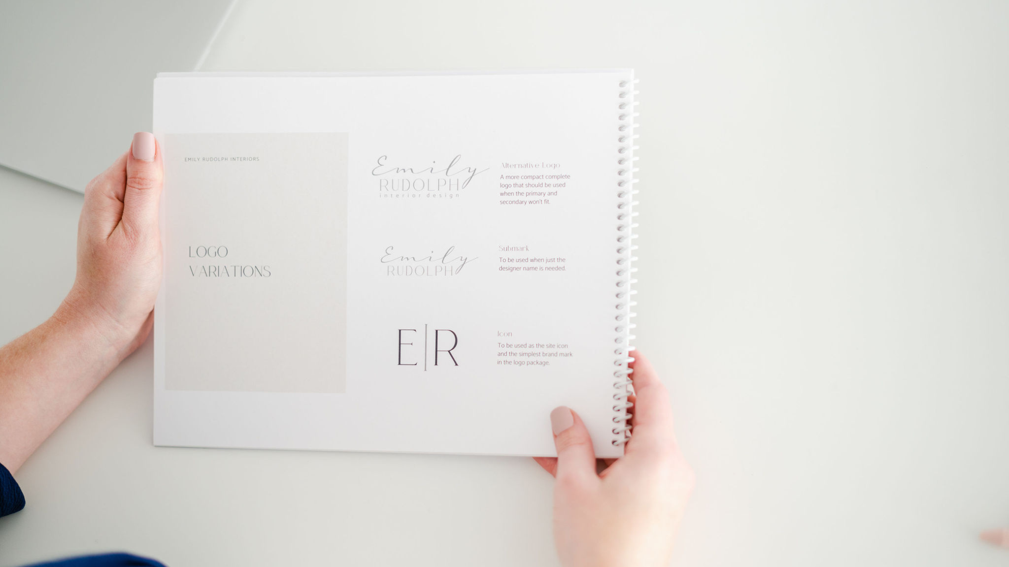
The reason why you can’t have just one logo is that it has limitations. No logo is perfect, and since a logo has limitations, only having one is a massive limitation for your marketing potential. See, every single logo ever designed is limited by its: shape, size, color, file type, & proportions.
No logo will ever look good in every single place you want to put it in your marketing. Sometimes it won’t be readable when it is scaled down. Other times the colors in the logo will make it hard to see on specific color backgrounds. These are just a small percentage of the ways things can go wrong by having just one logo.
So if you only had one logo in one color format, you have two options:
1. You place your logo no matter what, which may sometimes look unprofessional and even unreadable.
2. You only place your logo where it looks good, leaving you not brand identifiable in many places.
If you decide well, I will only make marketing where my logo looks good; then, you will limit the creativity and interest your marketing will have in the long run. None of these options are good which is why you need more than one. Having more logo variations to work with can give you different options of finding the logo that works the best in any give circumstance.
For a more visual representation of this, check out a clip from my Power of Logos masterclass, where I address the color, shape, and size limitations head-on. You can view it by watch the short video below.
If you want to see the complete masterclass to learn about the logo file types you must have in your branding tool kit and all of the other crucial details, you need to understand about your logos to utilize them properly REGISTER FOR THE FULL FREE MASTERCLASS HERE.
In conclusion:
Do you see why you definitely need more than one logo? The flexibility alone is worth it. Plus, you can spice things up in your marketing graphics but still build a recognizable brand if your logos are built properly.
To learn everything you need to know about logos and how to seamlessly place them in your marketing again & again access the replay of the full Power of Logos masterclass for free below!
Video Transcript:
0:01 So you need more than one logo. Most small business owners are going to believe that they, if they have one logo, they have a brand. 0:08 They are all set up and ready to roll. But ultimately what’s going to happen is that if you just have one logo in your branding toolkit, as I like to call it, you are gonna be limited where you can place that logo on all of your future marketing. 0:21 So from this day forward, I want you guys to start living by the rule that you need more than one logo for your branding. 0:29 And we’re gonna dive into that in this video. So first off, here are some examples of brands that I built in the past. 0:35 And as you can see, no brand looks alike. They all have a different feel to them. They all have a different color palettes, they all have different design accent in them is because every business has its own unique brand, they should feel and look different. 0:50 But you’ll also notice that all of them have a variety of logos. They have different shapes, they have different sizes they have different colorings, they have different proportion wise, like if they’re really emphasizing their full emblem here versus just the words. 1:06 And this one, you can see that they have a nice kind of variety to them. And that is because no, not one logo is perfect and it’s not going to work in every single place that you could potentially put it, which is why I give my clients a variety of logos for them to work within their branding toolkit whenever they make their marketing. 1:25 Because one logo doesn’t allow for a versatile brand identity. One logo will not work on every piece of marketing. You wanna place it in the future. 1:35 It just won’t because a logo’s effectiveness on marketing is always limited by its color, shapes and size. And we’re gonna dig into some of these examples so you can see exactly what I’m talking about. 1:47 So let’s first look at color limitations. One logo does not work on every color background. In fact, it doesn’t work on a lot of color backgrounds just based on how we can view things in our human eye. 1:59 And how maybe a light color doesn’t look good on white and a dark color doesn’t look good on black. It’s the same thing for logos. 2:05 So let’s take an example and let’s look at Nike logos and their color palette. So everyone recognizes the Nike logo, the font, the swoosh. 2:14 It’s very, very popular. So obviously everyone knows what that looks like. What you might not know is this is kind of the standard color palette that Nike uses for their marketing. 2:23 Meaning that all of their marketing materials, they have these tones in them, okay? Which means that their logo needs to look good on these different colors. 2:36 Well, let’s look at that. So I took the black Nike logo and I placed it on the different colors. I put it on the green and the orange and the red, and you can see where it’s, it can be a little hard to see on the green, but props pretty well on the orange and the red. 2:51 But the black logo on the black box does not work because it just blends right in. So at the very least, you need to have two color Variations of your logos. 3:01 You need a a one that’s gonna be dark and look good on a white background and one that’s gonna be lighter and that’s gonna look good on a dark black background. 3:09 Okay? You also need to have a variety of shapes and sizes. Just that you can place it wherever you want because depending on the proportions of that logo and how well it’s going to scale up and scale down and fit into different places, you might need to put it in your marketing. 3:31 You could be severely limited if you only have one. Okay, so let’s take a look at this from one of my previous brand clients. 3:37 So this is amazing life health coaching. She is obviously a health coach. She works with women who are in their middle age and retirement age, and she really wanted to incorporate the cool Caltech no as a similar as a symbol for her. 3:52 Not only her heritage, but also a shield that protects women, which is something that was really powerful to her. She wanted something that was still professional but joyful. 4:01 So this is her brand. Okay? Now, after I finished her branding, we went on and I helped her make her marketing materials. 4:09 And one of the things she wanted was an email signature. So I went ahead and I made her email signature and I picked her main logo because it’s the main logo. 4:18 But I also picked it because proportionally wise, how tall it is, it actually fits really nicely with how much, how tall her contact information is in her email signature. 4:30 But the thing is, she came back to me and she said, you know what Megan? I actually would prefer to have my headshot in my email signature, just like how you have your headshot in yours. 4:38 Now, this was my brand at the time. It has since changed. But this was the email signature she was referring to when she said that she wanted that edit, which I was totally fine to comply with, but I knew that there was gonna be an issue with using her main logo just based on the shape and the arrangement of the logo itself. 4:58 So if she only had one logo in her branding toolkit, these are kind of her options to be able to put her headshot in her email signature. 5:07 She would either have to choose to do a big picture of her face and a small logo, which makes it then hard to read and just feels awkward and unproportional, or she would have to kind of do that 50 50 balance, which is okay, but still not great because again, her logo is kind of small and harder to read, or she can make her logo really big and her head really small, which then again feels super awkward. 5:29 But since I created her branding and I knew that I had given her more than one logo, I just swapped out the logos. 5:36 I just chose to use a different logo that still represents her and her business, obviously, because it’s all still rooted in the same colors and the same fonts. 5:45 But proportionally wise, this one emphasizes the words more than the Celtic symbol. So that it could just sit nice underneath her photo, still be legible and still feel like it balances. 5:57 It’s Also very similar and height wise to just the contact information portion of her email signature, and it just seems to work. 6:04 So having these different shapes with different emphasizes on how big the words are and versus the symbol or the decorative accent inside her logo is super, super beneficial. 6:14 And it’s not just gonna happen here, but it’s gonna happen again and again and again. Anytime you ever wanna place your logo in your marketing. 6:23 So there’s also another reason why I like to have a variety of shapes. One of them is to have a circle logo, mainly for online business profiles, especially social media platforms, because those profile images are typically round. 6:37 Now, if you are a solopreneur or a small business owner and it’s just you running the show, you really should probably have your face and your profile images for sure if, especially if you’re a service-based business. 6:49 But if this c client is actually a dog rescue and it makes sense that they would have their logo in their social media profile because it’s not just one person, you know, so they needed a circle logo to be able to upload into those profiles because they’re the ones that actually fit on those profile uploads. 7:12 I’m sure you’ve tried to upload like a tall rectangle logo and it get cut off, or the squares, the corners always get cut off. 7:19 So having a round logo really makes it super beneficial to be able to just upload here in any other online profile that you need to like establish for your business and make look super professional. 7:32 So these are just several different reasons why you should have more than one logo so that you have an effective logo you can use in any, any marketing situation going forward. 7:43 So if you wanna see the rest of the masterclass where I talk about everything you need to know about logos, definitely register via the link below this blog post. 7:52 All right, I will talk to you later. Bye.


